Good Store: The Body Shop
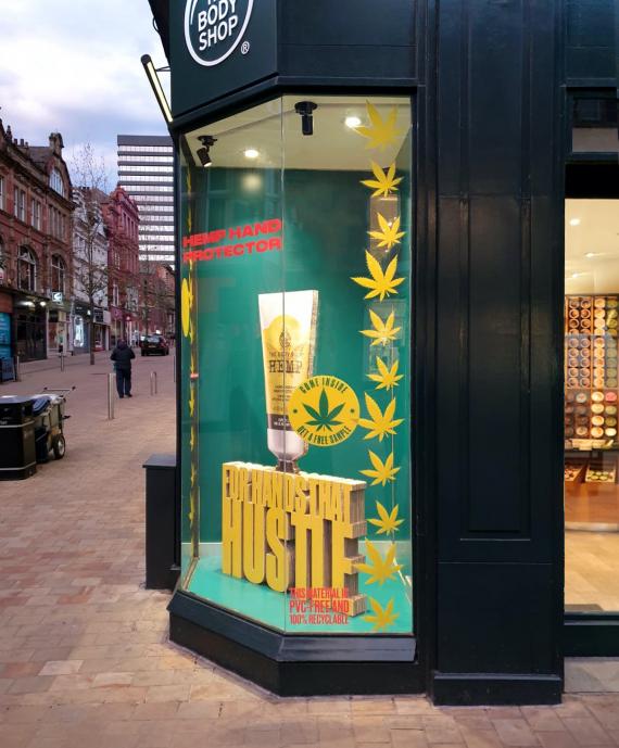
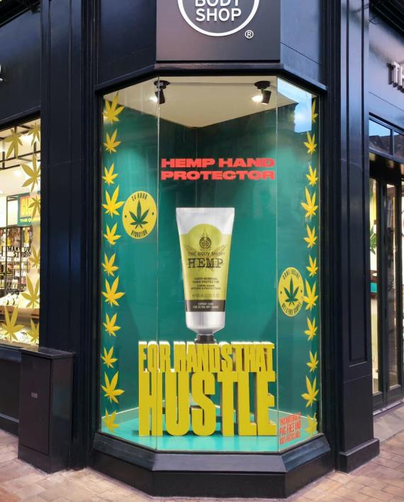
I believe that this is a great representation of a good window display. Everything about this window display is very organized. Even though it is not clothing it is still from a very popular brand. I like the way that the colors that they choose pop off of each other with the green and yellow. I also like the way that the lighting in the window makes it feel as if the words are coming out at you and as if they are floating. I also think the shadows help make this display stand out because the shadows help put the focus on the true advertisement which is the Hemp lotion. Both angles for this display are good too because the products are easily visible and the display is easily readable from both points of view. Overall I think that this display was well thought out and planned to help catch the eye of the customer.
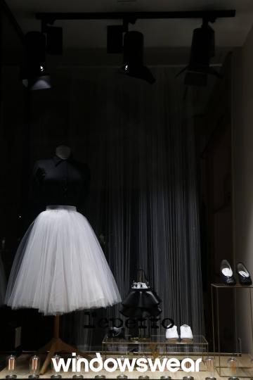
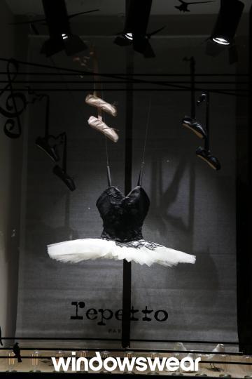
This display at Repetto was horribly designed. I do not like how dark it is and there are horrible shadows. I also feel it is incredibly plain. The slippers just hanging from the ceiling are not attractive and you can tell that this design was not well thought out. This window display would not catch my eye as something I would be drawn to. I think it needs a lot of work to be considered eye-catching.
