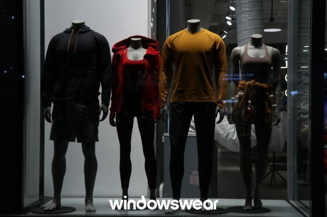
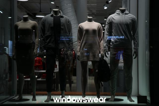
This display is for Lulu Lemon. I think that this is a very poor display because the lighting of the display is not well done. Overall, this is a fairly good display The products are symmetrical and the items would be clearly displayed in a way that gives a theme if the lighting wasn’t so poor. I think it is hard to even truly grasp what they are wearing because the lighting is so poor. This display made it obvious why lighting is important to remember when planning your displays because you want it to catch the consumer’s eye immediately and if they can’t see it because it is dark they are not going to be drawn to it. I also think that it is hard to tell if the display is telling a story. I think that the display is mediocre because it does display the products well but it does not get a message across as to what the display is supposed to be saying.
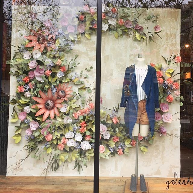
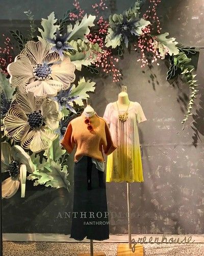
Anthropologie does an amazing job of creating beautiful window displays for each season. This is something that they pride themselves on. I think that these displays for their Spring window are very well done. The lighting is very great and does a great job of letting you se the outfit items that they picked. They also chose greenery and spring flowers that coordinated really well with the outfits they chose to put on their display mannequins. Everything is highlighted very well and does an amazing job of advertising the product and also getting people excited to shop for the Spring season with this beautiful display. There is a lot of balance and texture to make this truly pop.
