
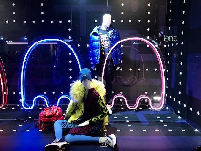
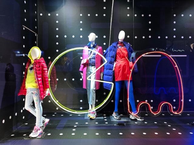
I think that this a great visual display. It is bright and catches the eye. It also looks very “techno” and draws back feelings of nostalgia which consumers love. It uses extremely great lighting and also gives what I feel is a very clear message. It has unity and balance throughout the display and is very easy to understand what the message is.
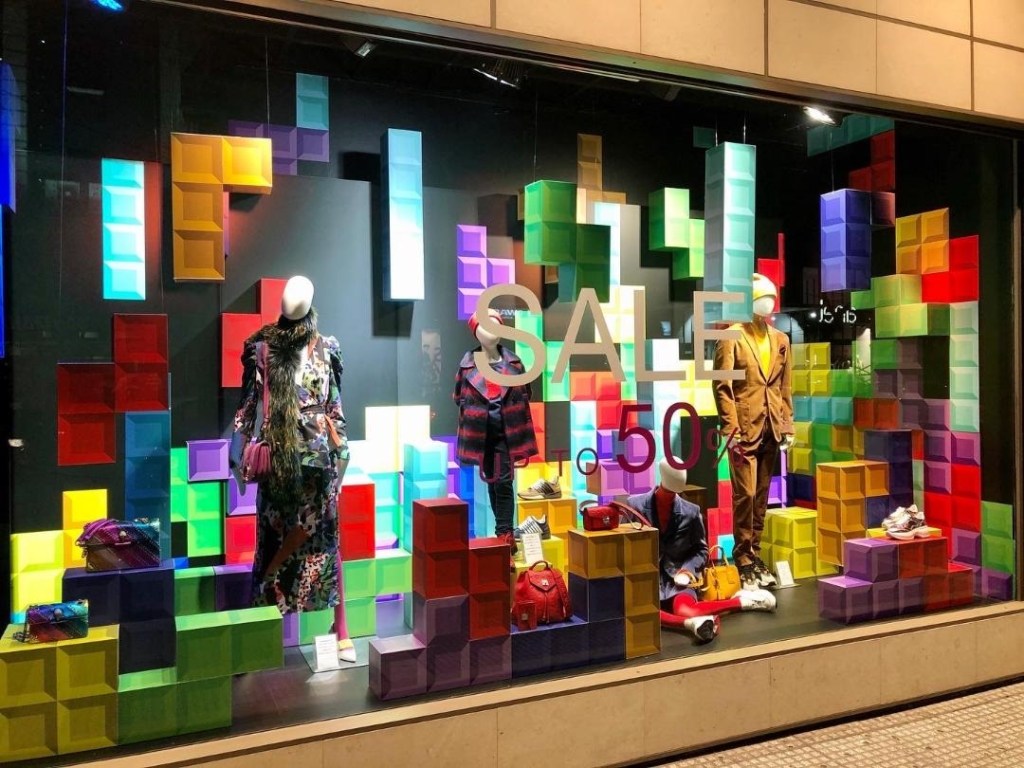
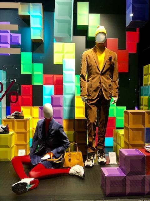
I think that this is a horrible display. It is busy and hard to understand where to focus my eye on. While there are clothes being advertised, I think that it would be easy to not realize that clothes are being advertised because they get lost in the other props being used. There is no direction and there is absolutely no unity. I do not like the amount of color combos being used here either. It is distracting and they do not go well together.
