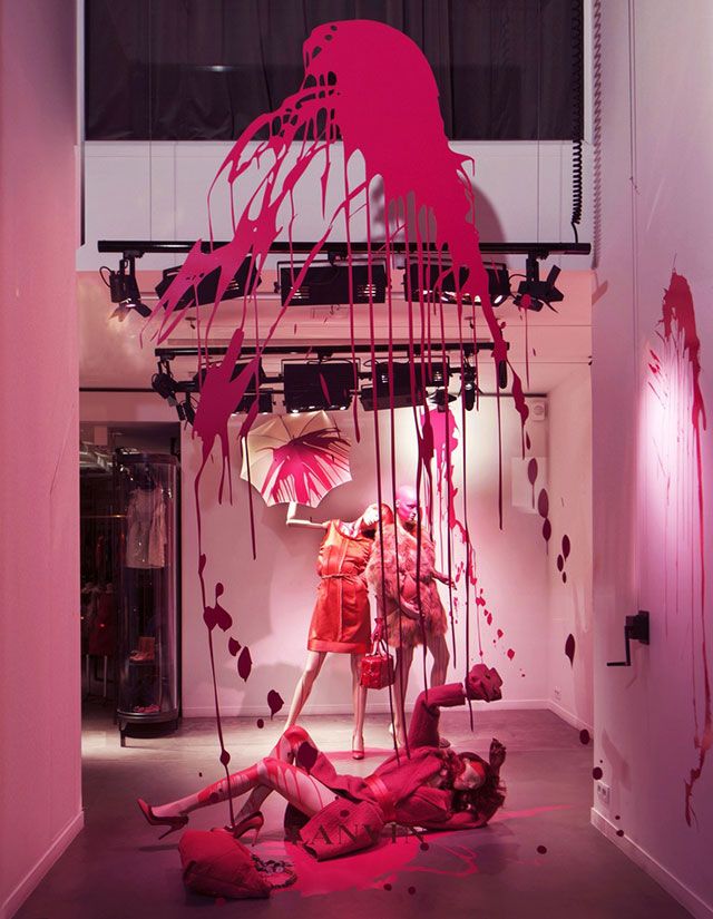
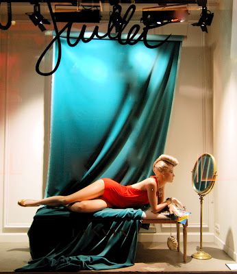
I think the photos above both tell some amazing stories and that these are very well done window displays. They highlight in simplicity and allow themselves to be really great. I love the paint one because there is not a whole lot of action going on yet they still tell a really awesome story which is what the point of window displays are. With a window display you want to attract the customer with a story and express why they should want to invest in making that story their own with the purchase of the clothing being merchandised. In the pink photo the display is very assymetrical and shows a good balance while being perfectly imbalanced. I also think that there is a lot of repetition of color with all of the hues of pink and red used in this display. This tells an awesome message that is trying to be displayed. The green drape photo tells another story but also a simple story. You see a girl who is obviously assuming she is alone and doing something she enjoys in the most simple matter.
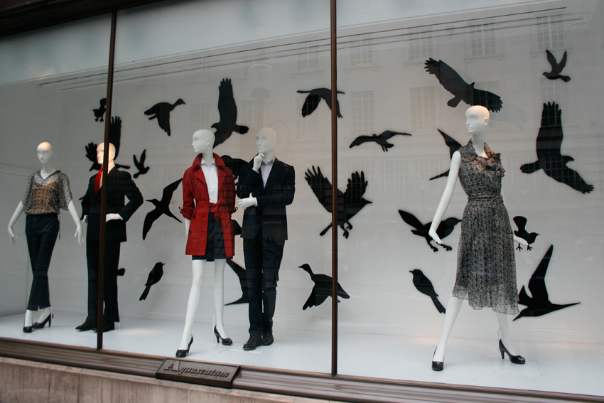

I think that both of these displays are poorly done. I think that the first display with the crows is confusing and it is hard to understand what the message they are trying to send off to their consumer. It comes off a little plain jain and the display items do not feel as if they go with the clothes being sold. The second photo looks like an amateur put it together with some supplies they had laying around the house. It is poorly done and looks like something someone working at the store with no experience in designing displays did. Both windows appear as if there was little research done or money spent to make these appealing window displays and that they did not have the consumer in mind when designing.
