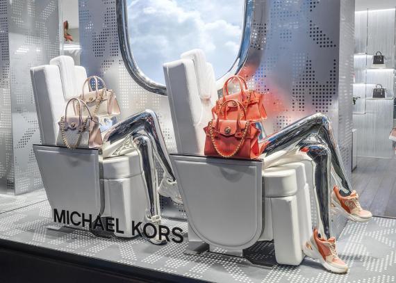
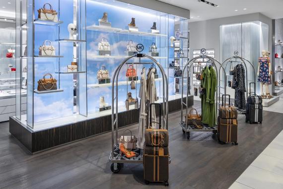
I love both of these Micheal Kors’ displays. I love how clean and luxurious this display feels. The first display is set to be on an airplane. It creates this desire that you need a luxurious bag for a luxurious trip. The display shows unity throughout and the interior of the store (2nd photo) goes along with the overall theme. The luggage carts and the cloud backdrop make you feel that you just need a bag form Michael Kors to have this amazing vacation. I love this layout and I think that this display shows a lot to the customer and really sets a clear message.
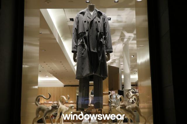
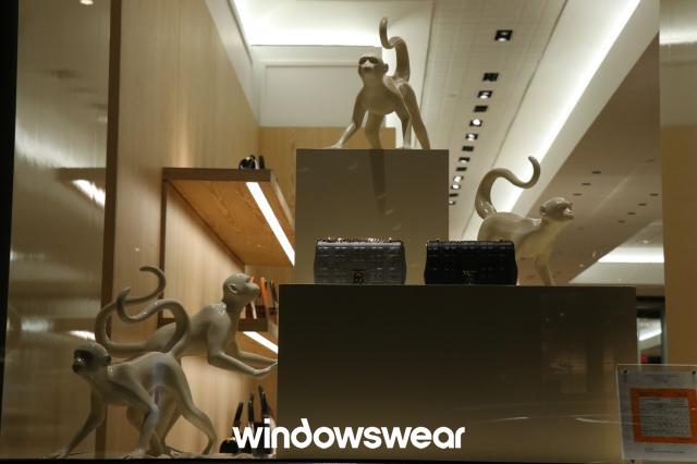
Everything about these windows is poorly done in my honest onion. While doing all one color can be good at times it has to be done with a lighting that balances off well with the chosen color. This does not do that. There is no unity provided by the use of all of the colors. It is not well established and it does not have great balance. Both window displays are very poorly done.
