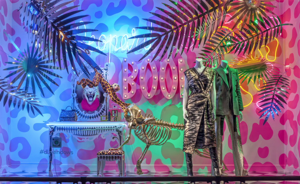
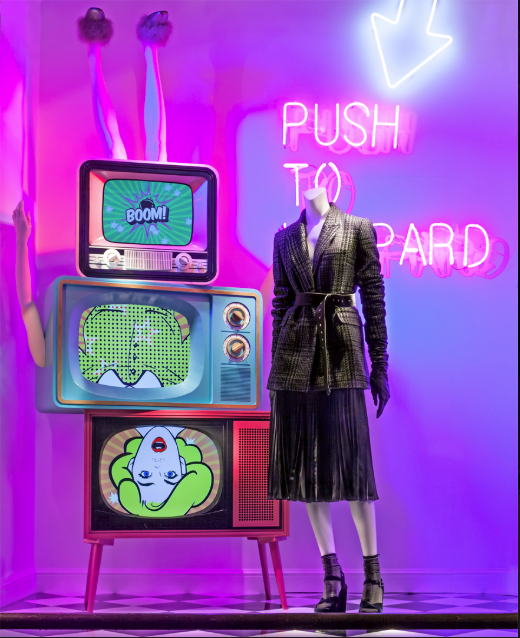
I love the concept of both of these displays. I love the way that the neon balances off the wild prints. It feels so retro and so modern all at the same time. I am instantly drawn to the displays. I think both do a good job of creating tension and drawing the eye. I also think that they use a good asymmetrical balance with their displays. If I passed by this window display I would be very drawn to check out the store as it is very catching.
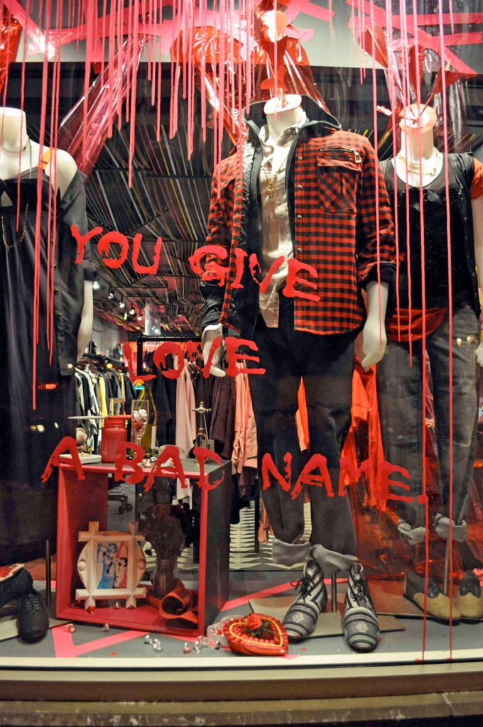
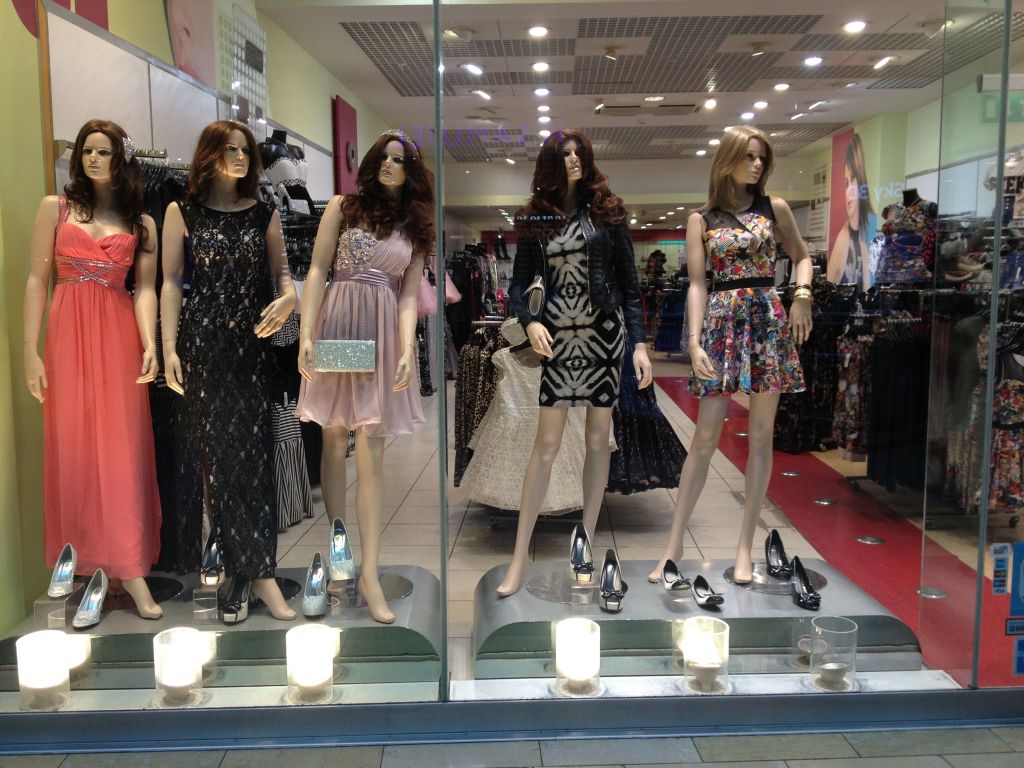
I think that the first display is really good to the blind eye. If you did not know what you were looking at, I think that you would think that the job was a well done job. In my personal opinion though the paint that drips on the window is a slight distraction from the product being modeled and can be hard to see. I think that the message is clear but the message could have been put together better. The second photo is just a mess and it honestly grosses me out that it would have been put in a window display. There is no direction and the artistic touch is not there. It is obvious that the person who put this display together does not have experience or education on window displays.
