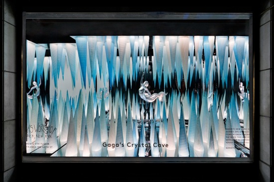
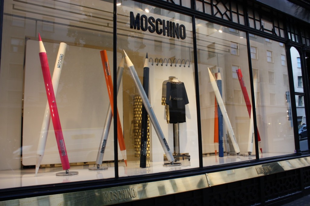
The first window display with the icy blue is breath taking under the lighting that was used. I love the way the metallics reflect off of the blues. There is a lot of symmetry in this display as well as the center of the display has an object in it and nothing else but the colored blue stands the rest of the display. The second display is so beautifully done. I love the oversized colored pencils and the way that they cross each other with the notepad directly behind the outfit, seeming as if a drawing has come straight to life. I love the symmetry and the way the pencils are even spacing.
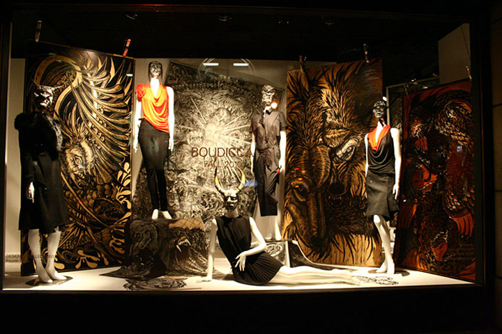
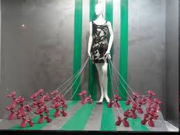
The first photo is very dark and very full of too many textures. It makes it hard to know exactly where to look. I have trouble keeping my eyes focused on one thing. While it was obviously a well thought out display, I feel that it simply missed the mark. It just didn’t quite coney the message it was supposed to. The second display on the other hand is just poorly done overall. It appears that no thought went into making this display. The colors do not reflect well off of each other and the display does not tell a thoughtful story.
