Featured

Introducing Myself

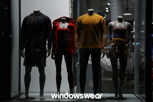
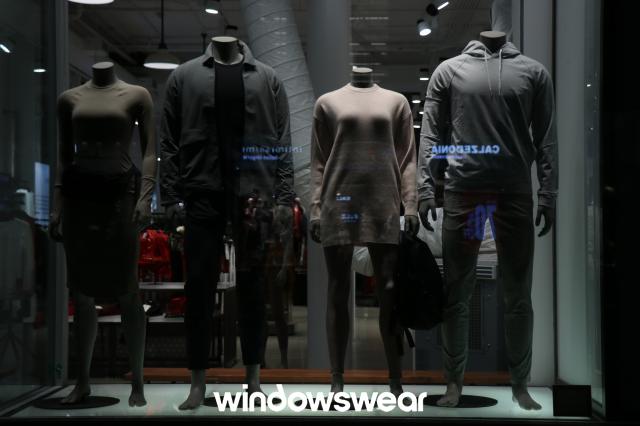
I am a senior at Illinois State University and I am a Fashion Merchandising major with a minor in Business Administration.

My career goals are to eventually own my own successful clothing store. When I graduate I am hoping to work in a successful and established company while I grow my boutique on the side until I can grow my business enough to run it on my own. I have prepared for that success by working in the retail industry since I was seventeen years old. I worked at PetSmart for a little over two years where I worked on many of their displays in the store I worked at and I also planned many of their “customer events”. While this is not a clothing store it did help prepare me in having a better understanding of how to make things more visually appeal to the customer more. When planning the events I was given very limited supplies to make the events successful and I had to learn with my even more limited budget what to make work to create our customer events. I also interned at Royal and Reese which helped prepare me in my knowledge of customer service and also understanding trends to understand how best to sell to a customer on an online platform. There I learned about online visual merchandising and how making websites and photos for the website more visually appealing is essential to creating a successful online presence as a store.

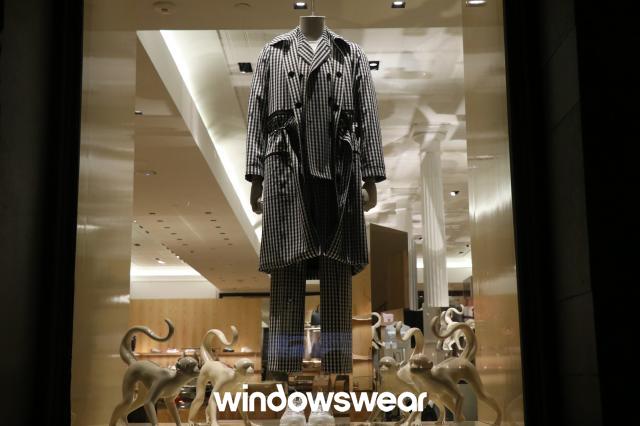
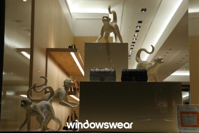
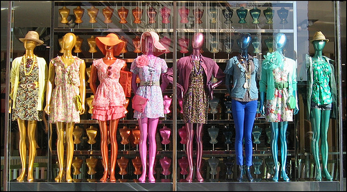
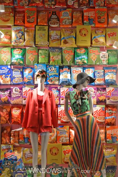
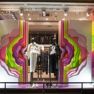
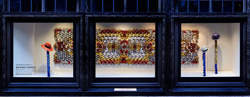
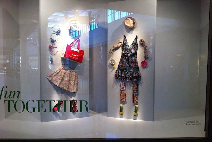
My goal for this blog is to display my portfolio for my future careers as a way to document the work I have completed in college and after college. I want to use it to frequently update where I am at with my career and what kind of bounds in my success I am making.

Visual Merchandising Analysis #9

The first window display with the icy blue is breath taking under the lighting that was used. I love the way the metallics reflect off of the blues. There is a lot of symmetry in this display as well as the center of the display has an object in it and nothing else but the colored blue stands the rest of the display. The second display is so beautifully done. I love the oversized colored pencils and the way that they cross each other with the notepad directly behind the outfit, seeming as if a drawing has come straight to life. I love the symmetry and the way the pencils are even spacing.

The first photo is very dark and very full of too many textures. It makes it hard to know exactly where to look. I have trouble keeping my eyes focused on one thing. While it was obviously a well thought out display, I feel that it simply missed the mark. It just didn’t quite coney the message it was supposed to. The second display on the other hand is just poorly done overall. It appears that no thought went into making this display. The colors do not reflect well off of each other and the display does not tell a thoughtful story.

Visual Merchandising Analysis #8

I love the concept of both of these displays. I love the way that the neon balances off the wild prints. It feels so retro and so modern all at the same time. I am instantly drawn to the displays. I think both do a good job of creating tension and drawing the eye. I also think that they use a good asymmetrical balance with their displays. If I passed by this window display I would be very drawn to check out the store as it is very catching.

I think that the first display is really good to the blind eye. If you did not know what you were looking at, I think that you would think that the job was a well done job. In my personal opinion though the paint that drips on the window is a slight distraction from the product being modeled and can be hard to see. I think that the message is clear but the message could have been put together better. The second photo is just a mess and it honestly grosses me out that it would have been put in a window display. There is no direction and the artistic touch is not there. It is obvious that the person who put this display together does not have experience or education on window displays.

Visual Merchandising Analysis #7

I love both of these Micheal Kors’ displays. I love how clean and luxurious this display feels. The first display is set to be on an airplane. It creates this desire that you need a luxurious bag for a luxurious trip. The display shows unity throughout and the interior of the store (2nd photo) goes along with the overall theme. The luggage carts and the cloud backdrop make you feel that you just need a bag form Michael Kors to have this amazing vacation. I love this layout and I think that this display shows a lot to the customer and really sets a clear message.

Everything about these windows is poorly done in my honest onion. While doing all one color can be good at times it has to be done with a lighting that balances off well with the chosen color. This does not do that. There is no unity provided by the use of all of the colors. It is not well established and it does not have great balance. Both window displays are very poorly done.

Visual Merchandising Analysis #6

I think that the two photos above are good window displays. The first photo uses an assortment of colors but balances. There was also a lot of rhythm and unity to the photo. I love that t has a rainbow effect and that you can tell the window display is definitely telling a story. I like the second photo because of the use of minimalism. The window display feels powerful with the use of the minimalism and the giant Eagle. It is a true masterpiece.

I do not think that the first photo needs a lot of explaining as to why it is a horrible window display. The window is poorly lit, it has almost no supporting props to go with the clothing being displayed and it looks very plain and boring. I think that this is not a window that would catch my eye. The second window display is definitely eye catching except that my eyes don’t know where to look. The backdrop is very distracting from the clothing being advertised and with the amount of color being used, I am unsure what the message is supposed to be.

Visual Merchandising Analysis #5

I think that the first photo is an amazing window display. It is eye catching and has lots of dimension. I love the way that the walls are different dimensions as they break apart to show the clothing being advertised. I love the variety in color as it breaks as well. It looks very symmetrical and well put together. Overall a great display. I also love the second display photo because it used all of the space give (which was large) without making it seem under done or overdone. It is very symmetrical and well put together.

I think that the first window display is not done well because it doesn’t really tell a story. It uses very little props and while the idea of creativity is there the message is not well received as it is hard to understand what that idea might have been. I think that the use of more props and mannequins could have really helped this display. The second photo is wild and very loud with a lot of stuff going on. I think it is hard to decide what the message and story are. It just looks like clothes were just thrown together for a display quickly and not well thought out.

Visual Merchandising Analysis #4

I think the photos above both tell some amazing stories and that these are very well done window displays. They highlight in simplicity and allow themselves to be really great. I love the paint one because there is not a whole lot of action going on yet they still tell a really awesome story which is what the point of window displays are. With a window display you want to attract the customer with a story and express why they should want to invest in making that story their own with the purchase of the clothing being merchandised. In the pink photo the display is very assymetrical and shows a good balance while being perfectly imbalanced. I also think that there is a lot of repetition of color with all of the hues of pink and red used in this display. This tells an awesome message that is trying to be displayed. The green drape photo tells another story but also a simple story. You see a girl who is obviously assuming she is alone and doing something she enjoys in the most simple matter.

I think that both of these displays are poorly done. I think that the first display with the crows is confusing and it is hard to understand what the message they are trying to send off to their consumer. It comes off a little plain jain and the display items do not feel as if they go with the clothes being sold. The second photo looks like an amateur put it together with some supplies they had laying around the house. It is poorly done and looks like something someone working at the store with no experience in designing displays did. Both windows appear as if there was little research done or money spent to make these appealing window displays and that they did not have the consumer in mind when designing.

Visual Merchandising Analysis #3

I think that this a great visual display. It is bright and catches the eye. It also looks very “techno” and draws back feelings of nostalgia which consumers love. It uses extremely great lighting and also gives what I feel is a very clear message. It has unity and balance throughout the display and is very easy to understand what the message is.

I think that this is a horrible display. It is busy and hard to understand where to focus my eye on. While there are clothes being advertised, I think that it would be easy to not realize that clothes are being advertised because they get lost in the other props being used. There is no direction and there is absolutely no unity. I do not like the amount of color combos being used here either. It is distracting and they do not go well together.

Choice Project-Apricot Lane

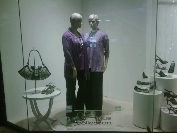
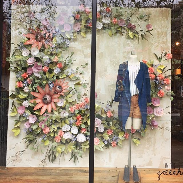
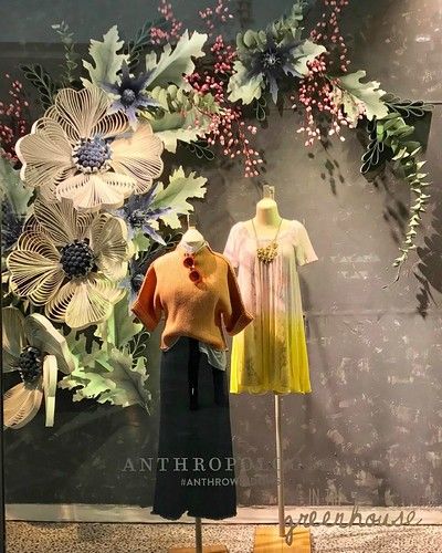
My group picked to do Apricot Lane for our choice project. I believe that overall the experience that we had at Apricot Lane was very good. I actually went back the next day on my lunch break and bought shoes there because I loved the customer experience and the product selection that they offered. The store was light and airy and easy to move around in which created a positive experience for the consumer. The store had an organized free-flow layout that allowed but also forced the shopper to travel throughout the entire store to look at items. Even when the store was busy it did not feel crowded. Overall, I think that this project was successful because I learned that how a store is laid out and the small details like lighting and props/graphics can really play into what your thoughts are of a store and how likely you are to have a good experience at that store.

Visual Merchandising Blog Post #2

This display is for Lulu Lemon. I think that this is a very poor display because the lighting of the display is not well done. Overall, this is a fairly good display The products are symmetrical and the items would be clearly displayed in a way that gives a theme if the lighting wasn’t so poor. I think it is hard to even truly grasp what they are wearing because the lighting is so poor. This display made it obvious why lighting is important to remember when planning your displays because you want it to catch the consumer’s eye immediately and if they can’t see it because it is dark they are not going to be drawn to it. I also think that it is hard to tell if the display is telling a story. I think that the display is mediocre because it does display the products well but it does not get a message across as to what the display is supposed to be saying.

Anthropologie does an amazing job of creating beautiful window displays for each season. This is something that they pride themselves on. I think that these displays for their Spring window are very well done. The lighting is very great and does a great job of letting you se the outfit items that they picked. They also chose greenery and spring flowers that coordinated really well with the outfits they chose to put on their display mannequins. Everything is highlighted very well and does an amazing job of advertising the product and also getting people excited to shop for the Spring season with this beautiful display. There is a lot of balance and texture to make this truly pop.

Visual Merchandising Analysis #1

Good Store: The Body Shop

I believe that this is a great representation of a good window display. Everything about this window display is very organized. Even though it is not clothing it is still from a very popular brand. I like the way that the colors that they choose pop off of each other with the green and yellow. I also like the way that the lighting in the window makes it feel as if the words are coming out at you and as if they are floating. I also think the shadows help make this display stand out because the shadows help put the focus on the true advertisement which is the Hemp lotion. Both angles for this display are good too because the products are easily visible and the display is easily readable from both points of view. Overall I think that this display was well thought out and planned to help catch the eye of the customer.

This display at Repetto was horribly designed. I do not like how dark it is and there are horrible shadows. I also feel it is incredibly plain. The slippers just hanging from the ceiling are not attractive and you can tell that this design was not well thought out. This window display would not catch my eye as something I would be drawn to. I think it needs a lot of work to be considered eye-catching.

Design a site like this with WordPress.com
Get started